


The 155th Block: Between the devil and the deep blue sea
The great blue yonder of Twitter Blue

This week…
Your reading time is about 8 minutes. Let’s start.
Twitter is removing legacy blue checkmarks but reinstating some without consent.
The blue checkmark used to denote accounts that have been verified as authentic.
Now, it means that someone paid a monthly subscription of $8 to Twitter Blue.
Removing the legacy checkmarks was Elon Musk’s attempt to convert verified users to pay for their checkmarks.
Yet, according to data from independent researcher Travis Brown, NBC’s Ben Collins reported that Twitter Blue only netted 28 new subscribers the day after the purge. Brown posted an update stating that there is now a net increase of 12,000 Twitter Blue accounts as of April 23, but they are largely accounted for by Musk’s decision to gift the checkmarks.
High-profile accounts, particularly official ones, seemed uninterested in paying for their checkmarks. Many celebrities were also apathetic about losing their legacy checkmarks.
If anything, famous individuals, including LeBron James and Stephen King, publicly declining their gifted checkmarks and denying they paid for them indicates that the product is such an embarrassment to endorse it now has a negative social value.
These gifted accounts show the same descriptor as paid subscribers — that they are subscribed to Twitter Blue and supplied their phone numbers for verification, which is misleading. An argument could be made that that’s a form of false endorsement, which is illegal in many jurisdictions.
This resulted in a meltdown from formerly unverified users who paid for their checkmarks. By meltdown, I meant ‘Pay the $8’ trended on Twitter, and I took a peek. Let’s call this phenomenon the Twitter version of the nouveau riche tragedy.
The nouveau riche, and Musk himself, consider the blue checkmark a status symbol of the elite. Musk’s subscription programme finally allows anyone access to be part of the privileged group. Oh, the irony.
The nouveau riche paid the membership fees, only to realise the ‘elites’ had left the country club — or rather, they were threatened to pay to stay or be kicked out, and accepted the latter.
The New Blue are disgruntled to learn that now that they have paid for their status, Musk decides to play god by reinstating the Old Blue status to whomever he sees fit, without them having to fork out a single cent.
More importantly, account verification is not (or should not be) about class division.
The verification process minimises the risk of misinformation from bad actors or even mere cheeky impersonators.
The introduction of the gold and grey checkmarks, for verified organisations and government-affiliated accounts, respectively, seems to be an effort to counter that.
But that makes legacy blue checkmarks rather obsolete. And that partially explains the general indifference from many legacy checkmark holders to pay up.
And now, a selection of top stories on my radar, a few personal recommendations, and the chart of the week.
Climate change: multi-country media analysis shows scepticism of the basic science is dying out
James Painter for The Conversation:
First, we found that on mainstream channels, the presence of science scepticism, science sceptics and general contestation around the IPCC’s report was much less present in our sample than in the coverage of the previous round of IPCC reports in 2013 and 2014, even in countries that have historically had strong traditions of science denial.
Second, response scepticism was in some of the coverage by mainstream channels. But in most cases, these were examples of “directed” scepticism. In contrast, there was more non-specific response scepticism on right-wing channels such as right-wing politician and pro-Brexit campaigner Nigel Farage on GBTV arguing that “whatever we do here [in the UK], it’s China that needs to do far more than us”, or a commentator on Fox News suggesting that “only being able to fly when it is morally justifiable would lead to people having to entirely change their lifestyles”.
Painter et al. examined 30 news programmes on 20 channels in Australia, Brazil, Sweden, the UK and the US. The study is published in Communications Earth & Environment.
What journalists are missing when covering cancer research
Tara Haelle for AHCJ:
Reporting on cancer research can be intimidating. So many studies are published daily about dozens of different cancers, hundreds of treatments and thousands of potential carcinogens or other environmental factors.
One challenge is reporting accurately on these studies while including appropriate context of existing research, since a single paper usually addresses one question. But before that challenge, journalists have to decide what studies to report on in the first place. A November 2020 study in PLOS ONE looked at research covered by four outlets in the U.S., U.K. and Australia and identified several areas that merit improvement.
Why does this matter? As the study’s authors wrote, “Poor reporting may hinder informed decision-making about modifiable risks and treatment selection, generate false or unmet expectations and undermine trust in science.” Novelty and effect sizes seemed to drive the selection of studies journalists covered, and basic research studies were particularly susceptible to being sensationalized.
Why AI writing tools are useless for science news
Matt Shipman for Science Communication Breakdown:
…While these tools draw information from a variety of sources, it is currently impossible for users to know how reliable any of that information is. There is, for example, a lot of inaccurate information on the internet. People often put things online – or in books, for that matter – that are designed to intentionally mislead.
What’s more, even information from reliable sources is subject to change. New discoveries often mean that things we thought we knew were wrong. Journal articles are retracted, due to human error or intentional fraud.
And it’s not clear how, if at all, AI writing tools are able to distinguish between any of these sources. A good science writer, for example, can be relied upon to do the critical thinking necessary to identify wildly inaccurate information in an online story or to avoid citing a journal article that has been retracted. We have no reason to believe that AI content generators are doing the same things. In fact, at present, we have every reason to believe that AI content generators are very bad at sorting reliable information from misinformation.
What I read, listen, and watch…
I’m reading a fascinating piece by Martin Enserink and Jon Cohen for Science about GISAID’s creator Peter Bogner’s sketchy past and the discovery of his invented alter ego, Steven Meyers. How does it affect the genetic database essential for sharing and tracking genomic data of influenza viruses, including COVID-19?
I’m listening to an interview with Sander van der Linden about the science of misinformation on Nature Podcast. I had the pleasure of interviewing him while I was at Wolfson College; he is a great speaker. Here he discusses his new book, Foolproof.
I’m watching Jury Duty, a mockumentary where everyone but one person is an actor.
Reviews, opinion pieces, and other stray links:
Social media is doomed to die by Ellis Hamburger for The Verge.
AI pop culture is already here by Kyle Chayka for The New Yorker.
Americans mostly believe news they hear on podcasts by Sara Fischer for Axios.
The winner of a major photography award has refused his prize after revealing his work was created using AI by Paul Glynn for BBC.
Racismo en Hollywood: ¿pueden los latinos blancos ser discriminados? by Luis Pablo Beauregard for El País.
Chart of the week
Late this week, Twitter stripped state-affiliated and government-funded labels off all media accounts. But before that happened, CBC, much like NPR and PBS before them, contested that such labels slapped onto their accounts earlier this month were misleading and announced their pause from the platform.
National Post’s Tristan Hopper then showed that the CBC graphic, which showed its sources of revenue, was just as misleading to the glee of those in the #DefundCBC camp (text format, compatible with screen readers available here).

Hopper is right about the misleading nature of the chart. At a glance, it may look like other sources of revenue were more than the government funding the CBC received. Upon closer inspection, you will notice a tilde on the y-axis between the $700 million and the $1,700 million values, representing $1 billion.
This is called y-axis truncation or y-axis break. It is a form of graph distortion that can save space (yeah, sure) but also mislead those unfamiliar with data interpretation — intentionally or unintentionally. Several Twitter users responded to Hopper’s tweet to provide a more accurate representation of CBC’s revenue chart, which shows a much more dramatic visualisation:
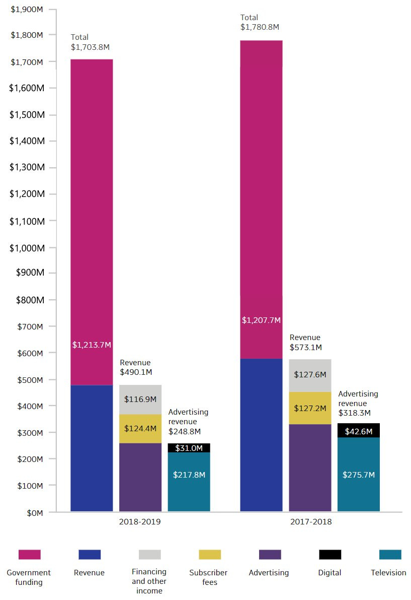
Make of that what you will. But, for further reading, in 2019, Michael Correll et al. deposited a paper on arXiv to explore whether truncating the y-axis is a threat or a menace. In the paper, they also provided several visualisation design solutions that could make y-axis truncation much more explicit:

And one more thing
On RQ1, Mark Coddington and Seth Lewis asked, “Is loyalty even a distinct phenomenon apart from the behaviours — like giving continued attention, sharing, and subscribing — that are often thought to characterise it?” Read on:


This post is pretty interesting! First of all, yes, Twitter has caused a lot of confusion and drama since Elno took over. You brought up some good points about the purpose of verification and the implications of Twitter's actions. It's cool to see how Twitter is changing and how that affects users in such a negative way. Secondly, I didn't even realize the graph distortion until you pointed it out. Had to look twice! Thanks for the reminder of the importance of presenting data transparently.
I'm sick of Twitter I deleted it. Trying out this SubStack thing but I'm not sure I if I like it yet.